Letters for Menu Boards: A 2026 Guide to Better Sales
· Thibault Le Conte
Saturday dinner service is moving fast. An Uber Eats ticket comes in for a limited-time special. The kitchen is already out. At the same moment, a guest at the counter points to that same item on the wall and asks for it.
Now your staff has two bad options. Apologize twice, or scramble to substitute something that wasn’t the customer’s first choice. Neither helps the line, the kitchen, or the guest experience.
That’s why letters for menu boards matter far beyond looks. A menu board is part of restaurant operations. If it’s wrong, staff lose time, guests lose confidence, and small errors spread into refunds, comps, and frustrated service. The smart play in 2026 isn’t just choosing nicer letters. It’s building a menu system where the physical board matches what your POS, delivery apps, and staff are selling.
The Hidden Cost of Outdated Menu Boards
Manual menu boards usually fail at the worst time. Not during setup. During the rush.
A breakfast cafe changes a pastry price in the POS but forgets to update the board before open. A lunch spot removes a sandwich from DoorDash after prep runs out, but the in-store board still shows it. A bar updates happy hour timing online, while the wall menu still lists the old offer. None of this feels dramatic in the moment. Operationally, it’s expensive.
Industry data cited in this market overview of magnet menu board letters shows that manual letter boards can be responsible for up to 25% of order errors due to outdated pricing or item availability, and syncing them with POS and delivery apps can cut menu update time from hours to minutes.
That number matters because menu mismatches create more than one problem at once:
- Front-of-house friction: Staff have to explain why the board says one thing and the register says another.
- Kitchen waste: Cooks start items that shouldn’t have been sold.
- Delivery mistakes: Third-party tickets keep coming in for items your team thought were already pulled.
- Lost trust: Guests notice when your menu feels unreliable.
Practical rule: If your menu changes in more than one place, somebody on your team needs one source of truth and one update routine.
A lot of operators still treat the wall board like decor. It isn’t. It’s a live sales tool. It influences what guests order, what staff recommend, and how fast the line moves. If you’re still handling menu changes as a loose task someone does “when they get a minute,” you’re building delay into service.
If you want design ideas before you change your process, this roundup of menu board ideas for restaurants is a useful place to start. Just don’t stop at aesthetics. The board has to reflect operational reality.
Choosing Your Letters Style Material and System
Before talking about restaurant delivery or POS integration, start with the physical system. If the board is hard to update, staff won’t keep it current. That’s the primary buying criteria.
Pick the system that matches your update frequency
Some owners buy letters for menu boards based only on brand style. That’s backwards. Start with how often you change prices, specials, and item availability.
If your board changes occasionally, a grooved rail system with tabbed letters can work well. If your team swaps specials often, magnetic letters are easier for speed. If your menu is fairly fixed and appearance matters more than flexibility, vinyl can give you a cleaner custom look, but it’s less forgiving when you need quick edits.
High-quality oak rail systems can last 10 to 15 years with proper care, which makes them a strong capital investment compared with constantly reprinting paper menus, according to this oak rail menu board guide.
Menu Letter Material Comparison
Material Type Best For Avg. Cost Pros Cons Plastic tabs Frequent but structured menu changes Lower upfront cost Easy to replace, widely available, works with tracked boards Can look utilitarian, sorting takes discipline Magnetic letters Daily specials, bars, cafes, quick swaps Moderate Fast to update, clean alignment, easy for staff to learn Requires compatible metal surface or system Vinyl stickers Stable menus with premium presentation Varies by installation Crisp appearance, polished branding Harder to revise quickly, not ideal for constant changes Wood or premium acrylic letter systems High-end cafes, bakeries, boutique hospitality Higher upfront investment Strong visual impact, durable with proper care Slower to change if the system isn’t designed for speed
One useful parallel comes from signage outside hospitality. This guide to home number sign materials does a good job explaining how material choices affect visibility, weathering, and maintenance. The same logic applies indoors. A board that looks great on install day but wears poorly under daily handling becomes a staff problem.
What works in real restaurant operations
A few practical rules hold up across concepts:
- Coffee shops and bakeries: Magnetic systems are usually easier if you rotate pastries, beans, or seasonal drinks.
- Fast casual counters: Plastic tab letters make sense when the core menu is stable and managers update pricing or combos on a set schedule.
- Higher-end cafes: Oak rails and glossy acrylic letters support the brand better than cheap felt boards.
- Multi-location operators: Standardize one board system across stores so replacement letters, staff training, and update routines stay consistent.
If you’re evaluating the visual side too, menu design software for restaurants can help you map layout choices before you commit to the board format.
Buy the board your least experienced shift lead can update correctly in a hurry. That’s usually the right board.
Designing for Readability and ADA Compliance
A menu board can be stylish and still fail. If guests can’t scan it quickly, service slows down.
Readability starts with simple choices. Use high contrast. Group items clearly. Keep category headers obvious. Treat the board like a newspaper front page. Headline first, details second, prices easy to locate.
Make the board easy to scan
Most guests don’t read menu boards line by line. They scan for anchors. Categories, standout items, and familiar price points guide the decision.
That means your layout should help the eye move naturally:
- Use strong section headers so customers can find coffee, burgers, sides, or desserts fast.
- Keep spacing consistent so the board feels organized rather than crowded.
- Limit decorative fonts because style loses value if guests need extra time to decode it.
- Separate modifiers and add-ons from core items so the main board stays clean.
The best letters for menu boards aren’t only durable. They stay legible from where customers stand.
Compliance affects design choices
For chains covered by menu labeling rules, readability is also a legal issue. The FDA’s menu labeling final rule applies to restaurants and similar retail food establishments with 20 or more locations operating under the same name and offering substantially the same menu items. It affects over 282,000 establishments, and non-compliance can lead to penalties. The rule requires calorie counts to be clearly displayed for standard menu items, according to this summary of the FDA menu labeling rule and letter board requirements.
That requirement changes how you design the board. You can’t just squeeze calories into the bottom corner and hope it passes. They need to be associated clearly with the item. For self-service or display foods, calorie listings also need to appear in close proximity.
Compliance check: If calories are required, design the board around that information from the beginning. Don’t tack it on after the layout is finished.
ADA-minded design helps everyone
Even when a specific ADA checklist issue doesn’t apply directly to the board format, the operating principle is simple. Make it readable for more people, in more conditions, with less effort.
Good practice includes:
- High contrast backgrounds and letters
- Consistent spacing between characters
- Minimal glare from lighting or windows
- Clear hierarchy between category, item, and price
- Placement where people in the queue can read before ordering
Readable boards shorten decision time. That helps guests. It also helps the cashier, because fewer people reach the register still trying to decode the wall.
Efficient Installation and Maintenance for Restaurant Operations
A menu board system fails when nobody owns it. Good hardware won’t fix a weak process.
The most efficient restaurants treat board updates like prep work. It’s assigned, timed, checked, and repeatable. That matters because letter boards work best for monthly, quarterly, or seasonal changes, while modular systems can support daily changes if the team uses a defined routine and templates.
Research summarized in this operational guide to changeable menu designs shows that restaurants using template systems and standardized update protocols can reduce time spent on menu changes by 40% to 60%.
Build a simple update protocol
Most operators don’t need a complicated SOP. They need one page and one accountable role.
A practical protocol looks like this:
- Assign ownership: One manager per shift owns final board accuracy.
- Set update windows: Before open, before peak lunch, and before dinner are common checkpoints.
- Use templates: Keep recurring formats for specials, combo offers, calorie displays, and sold-out messaging.
- Store letters by frequency: Separate common vowels, price symbols, and recurring promo words so staff don’t waste time searching.
- Close the loop: After a POS or inventory change, someone confirms the physical board matches.
Here’s the kind of workflow worth training on:
What works and what doesn’t
Some practices consistently save time. Others create avoidable friction.
What works
- Prebuilt lines for daily specials
- Backup character sets for high-use letters
- Manager signoff during opening checklist
- Board placement where staff can reach it safely and quickly
What doesn’t
- Storing all letters in one mixed bin
- Letting every employee create their own layout style
- Updating only when a guest points out a mistake
- Installing the board in poor light and blaming staff for errors
If your board area is dim, fix the lighting before you blame the design. In some spaces, especially older dining rooms, professional help with placement and visibility makes sense. A practical reference point is this page on indoor lighting installation services, which shows the kind of lighting considerations operators should think through when readability is suffering.
For teams juggling hardware, networking, printers, and in-store systems, a broader restaurant IT support checklist can help tie menu boards into the rest of operations.
Standardization beats talent here. You don’t want one employee who’s “great at the board.” You want any trained employee to update it correctly.
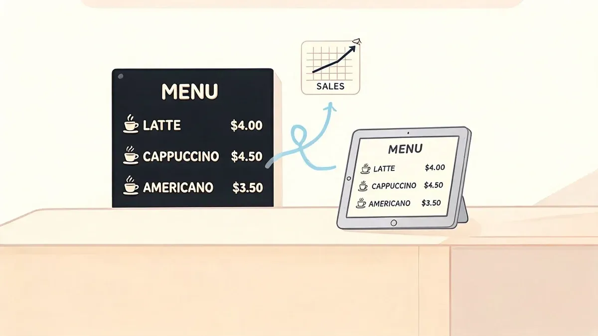
POS Integration Syncing Your Physical Board with Digital Orders
Most articles about letters for menu boards stop at fonts, grooves, and materials. That misses the operational issue which hurts restaurants. The wall board and the digital menu usually live in separate worlds.
That separation is why teams end up selling the wrong item in-store after they’ve already removed it from Uber Eats or DoorDash. It’s also why a price can be correct in Square but wrong on the wall, or changed in Clover but still outdated at the counter.
Build one source of truth
The fix is operational, not magical. Physical letters won’t auto-move on their own. But your restaurant can still run from a single source of truth.
That source should be your POS. If Clover or Square is where item names, pricing, modifiers, and availability are managed, every other menu version should flow from that same record. Your delivery apps should reflect it. Your online ordering should reflect it. Your physical board update routine should also reflect it.
A critical gap in restaurant tech guidance remains here. A source summary on hybrid menu systems notes that 68% of restaurants plan for hybrid digital-physical menus by 2026, yet guidance on how to sync them is limited. That same source states manual errors can be reduced by 40% when POS data from systems like Clover or Square is linked to delivery apps and physical board update protocols, as outlined in this discussion of open-face letter boards and hybrid menu workflows.
What that looks like in practice
Say you run a burger shop using Clover POS integration. You mark a seasonal shake as unavailable after the last batch sells out. That change should do three things operationally:
- Remove or disable the item in connected ordering channels.
- Notify staff through the normal shift workflow that the physical board needs updating.
- Trigger a quick verification so the cashier, kitchen, and guest-facing menu all match.
The same logic works with Square POS integration. If you change a lunch combo price in Square but nobody changes the board until the next day, the system isn’t integrated. It’s partially updated.
The physical board doesn’t need to be automatic. It needs to be governed by the same data and the same checklist as the rest of the menu.
Use restaurant delivery data to drive board updates
Restaurants often update the wall board based on memory. That’s the weak point.
Instead, use the systems your team already trusts. Availability reports, item-level changes, and shift-level manager checklists should drive the physical board. If an item gets 86’d for restaurant delivery, that’s also a signal for the board. If a combo changes in the POS, that’s also a signal for the board. If prep limits force a same-day removal, the board follows the same rule.
Food tech starts helping actual service instead of just creating another dashboard. The point isn’t to make the menu board digital. The point is to make the menu board accountable to the same operating system as the rest of the business.
If you’re comparing the broader category, this article on digital menu boards software is useful background. For many operators, though, a full digital screen isn’t necessary. A well-run hybrid setup often does the job better because the wall board keeps the brand feel while the POS drives accuracy.
The real trade-off
Digital-only menus are fast to change. Physical boards are often warmer, cheaper to maintain, and better suited to certain dining rooms. The mistake is treating that as an either-or decision.
The better question is this. Which system controls the truth?
If the answer is “whoever remembers to update things,” your menu process is fragile. If the answer is “the POS, with a clear routine for pushing changes everywhere,” your physical board becomes part of a reliable restaurant operations system instead of an isolated sign.
Your Next Step to a Smarter Menu System
The best letters for menu boards are the ones your team can update fast, read easily, and keep consistent with the rest of the business. That’s the standard.
A strong setup usually comes down to four decisions: choose a board system that matches your update frequency, design it for readability, give staff a repeatable update process, and let your POS drive every menu change. That’s what reduces confusion at the counter and keeps restaurant delivery channels aligned with what the kitchen can produce.
If your current process still depends on handwritten notes, memory, or end-of-shift catch-up, tighten that up first. Review your update checklist, confirm who owns physical board changes, and compare your wall menu against your POS and delivery apps today. A guide to online order management systems for restaurants can help you think through where those disconnects usually happen.
If you’re ready to stop re-entering menu changes across multiple systems, OrderOut connects delivery apps with POS platforms so your team can work from one menu source instead of chasing mismatches. Restaurant owners can also start onboarding for free in a few clicks.