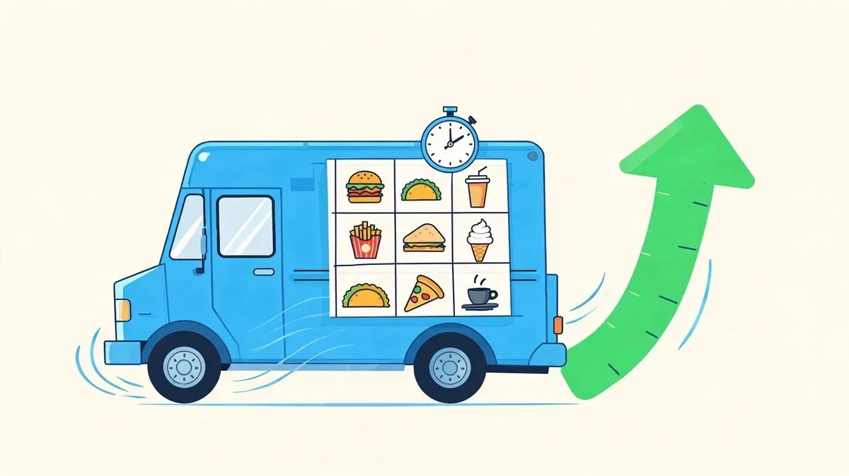
Food Truck Menu Template That Boosts Profit & Speed
· Thibault Le Conte
The problem usually starts the same way. Lunch hits, the line forms, and customers stare at the board too long. One person asks three questions. Another changes their order at the window. The cook is juggling too many ingredients in a tight space, and then an online order comes in with a modifier that doesn’t match what’s on the truck menu.
That’s not a food problem. It’s a menu system problem.
A good food truck menu template does more than list items and prices. It controls decision speed, prep flow, order accuracy, and how cleanly your in-person menu matches what customers see on delivery apps. If the template is cluttered, inconsistent, or disconnected from your POS, you feel it everywhere. Slower lines, more staff friction, more waste, more corrections.
Owners often treat the menu as a design task. In practice, it’s an operations tool. The trucks that run smoothly usually have the same thing in common. Their menu is short, readable, easy to update, and built so the same structure can carry over into restaurant delivery platforms and POS integration.
Why Your Food Truck Menu Isn’t Just a List of Food
A weak menu creates chaos in small ways that add up fast. The customer can’t scan it quickly. The cashier has to explain too much. The kitchen has to support too many ingredients. Then someone updates a price on the truck but forgets to update the delivery menu, and now staff is fixing mistakes during service instead of pushing orders out.
That’s why the menu template matters. It’s the operational blueprint for the truck.
What a bad menu does during a rush
When a board is crowded, customers stop the line because they need extra time to decide. In a food truck setting, that’s expensive. People are ordering while standing, often from a distance, with other customers behind them. If they can’t understand the menu quickly, line speed drops and your crew feels the pressure right away.
A bad template usually has a few predictable issues:
- Too many items: Staff has to stock, prep, and remember more than the truck can handle smoothly.
- No clear grouping: Customers bounce between tacos, drinks, sides, and specials without a natural order path.
- Inconsistent names: The item on the board doesn’t match the item in the POS or delivery app.
- Overwritten descriptions: Customers read more, not faster.
A food truck menu should reduce questions, not create them.
What a strong template actually changes
A strong menu template works like a quiet shift lead. It guides the guest, helps the cashier, and keeps the kitchen from overextending. It also gives you a cleaner base for digital systems later, which matters if you’re selling from the truck, through restaurant delivery apps, and through online ordering at the same time.
I’ve seen owners obsess over logo placement while the issue was menu friction. Fix the friction first. Branding still matters, but readable structure beats decorative design every time at the window.
There’s room for personality, of course. Even little brand touches in the service area can help the truck feel memorable. If you want some character in the workspace without cluttering the menu itself, a few well-placed humorous vinyl quotes for kitchens can add atmosphere where customers and staff notice it.
Menu Layout and Design for Fast Decisions
Lunch rush exposes weak layout fast. Three people are waiting at the window, one is reading from six feet back, your cashier is trying to keep the line moving, and DoorDash tickets are already printing. In that moment, your menu template is not decoration. It is a speed tool that has to work across the board at the truck, inside Square or Clover, and inside delivery apps where customers skim even faster.
Start with the distance test
A customer standing at the pickup area should be able to find three things immediately: what you sell, how the menu is grouped, and what each item costs. If they need to step closer, shade their eyes, or ask where combos are, the layout is slowing the line.
A good field check is simple. Stand where customers queue, not right under the board. If category names, core items, and prices do not read cleanly from that spot, increase size, simplify the board, or cut copy. For visual references, this menu board ideas guide for operators is useful, but the decision rule is operational: if it slows ordering, it does not stay.
Use these design basics first:
- Choose sans serif fonts: Plain fonts read faster at a distance and on mobile screens.
- Keep contrast high: Light text on dark, or dark on light. Busy backgrounds reduce speed.
- Build clear blocks: Mains, sides, drinks, combos. Keep the same grouping in your POS and delivery menus.
- Cut descriptions hard: A few words are enough if the item name does the heavy lifting.
Use hierarchy that matches how orders are placed
Customers scan truck menus in a pattern. They look for a category, then a familiar anchor item, then price. Strong hierarchy supports that sequence. Weak hierarchy forces people to hunt.
Put category headers at the top of each group. Give your highest-volume items the easiest position to spot. Keep prices aligned and easy to find. If you sell combos, place them near the items they relate to, not in a disconnected corner of the board. The same structure should carry into your POS screens and delivery channels. If the truck board says “Burrito Combo” but Uber Eats nests it under a different modifier path, staff spend the shift translating orders instead of producing them.
I do not use made-up precision here because the exact font size depends on board size, viewing distance, and whether you are printing or using a digital display. The practical standard is simpler. Headers should be visible first, item names second, and prices third. Best-sellers should sit in the spots customers notice without searching. On busy trucks, that usually cuts hesitation, reduces order corrections, and helps combo sales because the offer is seen at the right moment.
Practical rule: If a first-time customer has to ask where to start, the menu layout is costing you time.
What works under pressure
The best layouts hold up when the line gets long and tickets are coming from two directions. That is the test that matters.
Menu choice What works What fails Item count on screen A short visible list with room around each item Cramming every variant and modifier onto one board Typography Large, plain, high-contrast text Decorative brand fonts that look good on mockups and read poorly in service Photos One or two hero images tied to proven sellers Multiple competing photos that push item names and prices down Combo placement Next to top sellers or in the first scan zone Tucking combos below add-ons, sauces, or fine print
Digital boards need restraint. Slow transitions are fine if they do not hide core items. Fast slide rotations, flashing promos, and moving text create misses at the window and make order entry harder when the POS category flow does not match what the customer just saw.
Good menu design reduces friction across channels. It shortens the conversation at the truck, keeps item names consistent in Square or Clover, and lowers the chance that a delivery customer picks the wrong build on DoorDash or Uber Eats because the structure was unclear. That is the point of the template. Faster decisions, fewer errors, better throughput.
Menu Engineering and Pricing for Profitability
Friday lunch rush is where weak menu decisions show up. A customer asks three questions, the cashier hunts through modifier screens in Square, the cook reaches for an ingredient used in only one low-volume item, and the next ticket is already printing from DoorDash. Margin problems rarely start on the P&L. They start in the menu.
A profitable food truck menu does three jobs at once. It protects food cost, keeps production tight, and maps cleanly into the systems your team uses, including POS buttons, prep tickets, and delivery app listings.
The simple version of menu engineering
Start with four practical buckets:
- Stars: High sales, strong margin, easy to repeat.
- Plowhorses: High sales, weaker margin, still worth keeping if they drive volume.
- Puzzles: Good margin, low sales. These may need a better name, stronger placement, or a simpler build.
- Dogs: Low sales, low margin, high distraction.
The mistake I see often is keeping an item because a small group of regulars asks for it, even though it slows prep, adds one-off inventory, and creates an extra button path in Clover or Square. On a truck, every extra ingredient and every extra tap has a cost.
A shorter menu usually performs better because it is easier to prep, easier to ring in, and easier to keep consistent across the truck window and third-party delivery apps. There is no need to force a specific item-count rule here. The better test is operational. If an item adds complexity without adding clear profit, it should be renamed, repriced, simplified, or cut.
What to cut first
Cut based on friction, not emotion.
Use this filter for every item:
- Does it sell every service or only occasionally
- Does it share ingredients with your core sellers
- Can the team produce it fast during peak volume
- Does it travel well for DoorDash and Uber Eats
- Does it fit cleanly into your POS and modifier structure
- Does the margin justify the space it takes on the menu
If an item fails several of those tests, it is taking up more room than it earns back.
For owners tightening pricing discipline, this guide on how to calculate food cost percent helps connect menu choices to actual margin rather than guesswork.
A good explainer on menu thinking can also help frame the categories visually:
Pricing that supports speed
Price structure matters as much as price level. If customers need a full explanation before ordering, the menu is doing extra damage to throughput.
What works on trucks:
- Clear combo pricing: Make the upgrade obvious and easy to ring in as one POS item.
- Limited modifiers: Every extra choice increases order time, kitchen errors, and delivery-app confusion.
- Shared builds across channels: Keep the item name, base components, and add-ons aligned between your printed board, Square or Clover catalog, and DoorDash or Uber Eats menus.
- Strong anchors at the top: Put high-profit, high-confidence sellers where customers see them first.
I usually recommend pricing from the build out, then checking the workflow. An item with a great theoretical margin can still hurt profit if it needs too many custom steps, too many packaging choices, or too many exceptions in the POS. The best menu items sell well, ring in fast, and come out of the window the same way every time.
Creating Your Printable and Digital Template Files
Service starts in 20 minutes. A price changed this morning, one item is sold out, and your cashier is asking which file is current. If your menu template lives in three different places and none of them match, the problem is not design. It is file management.
Most food truck operators need two production-ready versions of the same menu. One file for print. One file for screens. Both should come from a single master so every edit starts in one place.
Build one master, then export two outputs
Keep one editable source file in Canva or another design tool, with category headers, item names, price fields, and brand elements fixed in place. That master file should work like a controlled template, not a fresh design project every time you need to make a change. Operators who skip this usually end up with a printed menu, a digital board, and a POS catalog that drift apart within a few weeks.
If you are comparing tools, this roundup of menu design software for restaurants is a practical place to start.
The file specs should match how the truck operates:
Format Recommended setup Why it matters Print menu file 8.5x11in or 11x17in at 300 DPI in CMYK Keeps prices and item names readable when printed and laminated Digital board file 1920x1080px Fits standard display screens without stretched text or cropped sections QR code block 2x2in with high error correction Improves scan reliability on a busy sidewalk or from a truck window
Those settings are practical starting points, not hard rules. A small truck with one exterior board may need larger type and fewer items. A truck running a digital pickup screen can fit more detail, but only if the layout still reads fast from a few feet away.
Keep updates simple for staff
The best template is the one a manager can edit in under five minutes before service. If changing a sold-out item means moving text boxes, resizing photos, and rebuilding the whole board, the template will fail the first time the truck gets busy.
Use a structure that protects speed:
- Lock category positions: Keep tacos, combos, drinks, or specials in the same place every time.
- Use fixed text boxes: Prices change. The layout should not.
- Set one image area: If you use photos, keep one pre-sized spot instead of rebuilding the design for each feature item.
- Save export presets: One preset for print PDF, one for screen PNG or JPG.
- Use version names staff can read: Date and channel work well, such as
menu-board-2026-05-10andmenu-print-2026-05-10.
I also recommend adding one working draft that is plain text only. No photos. No styling adjustments. Just the current item list, prices, and categories. That file gives you a fast backup when the printer fails, the screen file gets overwritten, or a last-minute menu change has to be pushed into Square, Clover, and your customer-facing menu at the same time.
One naming rule matters more than owners expect. Use the same item names in the template that your team uses in the POS and online ordering systems. If the printed board says “Loaded Fries Combo” but the POS button says “Fries Meal Special,” staff has to translate during the rush. That slows ordering, creates avoidable mistakes, and makes later menu sync work harder than it needs to be.
Integrating Your Menu with POS and Delivery Tech
Friday lunch rush exposes weak menu systems fast. A customer orders from the truck window, another orders the same item on DoorDash, and your cashier sees two different names, two different prices, or a modifier that only exists in one system. Staff stops selling and starts translating.
A food truck menu template has to do more than look clean on the board. It has to match the data structure inside your POS and the menus your delivery apps publish. If those systems drift apart, the cost shows up in refunds, remakes, slower training, and bad handoff between cashier, kitchen, and pickup.
The menu should match everywhere
Every item should carry the same core setup across channels:
- Name
- Price
- Modifier structure
- Category placement
That applies whether you run service through Square or Clover, then push those menus into delivery apps.
The template matters because it becomes the source file your team checks against the POS. If your printed board says “Loaded Fries Combo,” your POS says “Fries Meal Special,” and Uber Eats uses a third variation, someone has to interpret the order by hand. In a truck, that usually means the cashier does extra work, the kitchen gets a vague ticket, and the line slows down.
Why POS integration matters to restaurant operations
Good integration cuts repeat entry. It also gives staff one menu language to learn.
Operational area Without integration With clean POS integration Price changes Staff updates multiple systems manually One approved menu change is easier to carry across channels Order handling Team checks app orders against the truck menu Staff works from matching item records Training New hires memorize naming mismatches Everyone learns one item structure Modifiers Add-ons vary by platform Customers and staff see the same choices
Owners usually feel this first with modifiers, not main items. “Tacos” may match everywhere, but “add queso,” “protein swap,” or “combo drink choice” often breaks between the truck board, POS, and app menu. That is where wrong tickets start. A clear setup for an integrated POS system for restaurants helps prevent those mismatches before they reach the line.
A real-world example with delivery apps
Take Street Tacos. You raise the base price in the POS before service. DoorDash still shows the old price. Uber Eats has the right price, but one modifier group is missing, so customers cannot select the combo upgrade. Your cashier now explains the price difference at the window, your expo has to check the tablet, and your team burns time fixing an issue that started with menu structure.
The fix is simple, but it has to be disciplined. Build the template so each item has one standard name, one category home, and one modifier logic that can be carried into every ordering channel. Then treat menu edits like system edits, not design edits.
The best menu template is one your POS, your digital board, and your delivery channels can all read the same way. That turns the menu into an operating tool instead of a file your team keeps correcting during service.
Your Next Step From Menu to Money
A good food truck menu template does four jobs at once. It helps customers decide faster, keeps the kitchen focused, gives staff fewer chances to make mistakes, and creates a cleaner foundation for restaurant delivery and POS integration.
That’s why menu work has a direct payoff. You’re not just making the board look better. You’re tightening service, reducing waste, and making the business easier to run under pressure.
If your current menu feels heavy, start small. Cut weak items. Clean up naming. Simplify categories. Build one master template that works for print and digital. Then make sure the same item structure carries into your POS and app menus.
For operators who want more revenue from the same service window, this guide on how to increase sales in a restaurant offers more practical ways to connect operational discipline with stronger sales.
The key next step is simple. Audit your menu as an operating system, not a graphic design file. If your team is still typing the same menu into multiple places, fixing errors by hand, or managing different versions across channels, that’s the bottleneck to remove.
If you want one place to connect your POS menu with delivery apps and reduce manual menu work, start with OrderOut. Restaurant owners can also begin onboarding in a few clicks through the OrderOut dashboard.